GoBituary Rekindled

UX/UI

Research

Challenge

This project sought to spark personal reflection and a deeper sense of civic connectedness by presenting history not as a fixed record but as a participatory and evolving dialogue.

Solution

GoBituary Rekindled is a hybrid digital-physical history project that invites university community members to engage with the legacy of individuals who shaped the early development of UC Berkeley. By learning about the lives of those who made a mark on their communities (for better or for worse), users are encouraged to consider their own stories and how they, too, might shape the future of their institutions and neighborhoods.

Research

Motivations

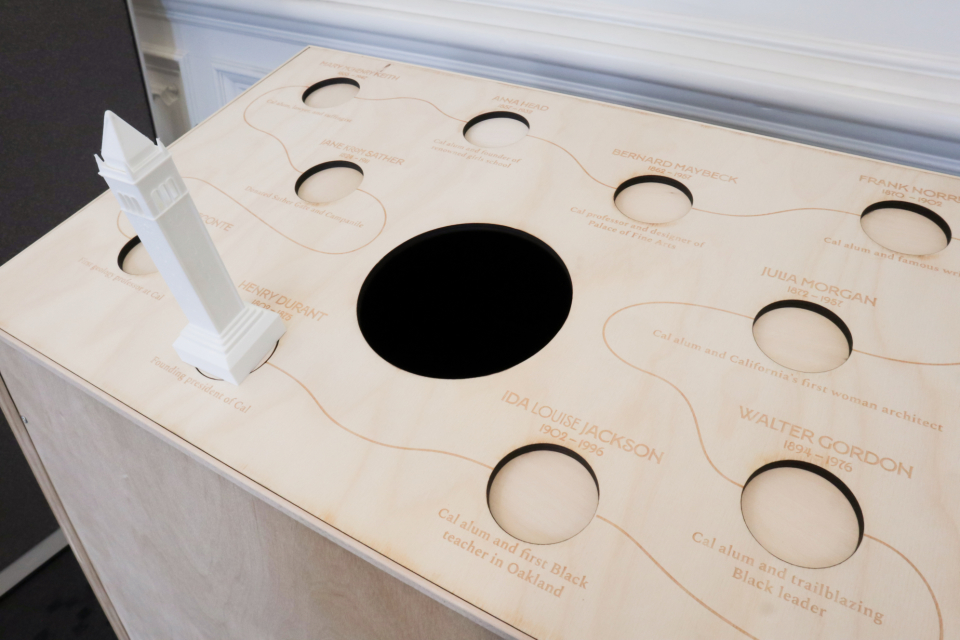
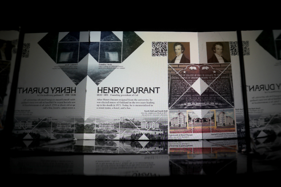
This project is an extension of the original GoBituary website, and similarly seeks to enhance understanding of local history. The general public seems generally unaware that many historic cemeteries offer tours that are very informative and worthwhile, so we saw this as an opportunity for exploration.

Since convincing people that cemeteries are actually super cool and you should totally go visit one is a tall task, we focused on bringing the educational benefits of going to a cemetery into spaces that feel more communal.

Research Questions

  • RQ1: How do memorials promote engagement with local history?
  • RQ2: What historical content promotes a feeling of connection between the individual and their community?
  • RQ2.1: What historical content do people find intriguing and/or memorable?

More detailed information about this project's research and methodology can be found in the report (PDF) available on the project website.

User Testing

Our research questions were largely answered by rapid prototyping. We iterated over the design of the monument, inside and outside, to test our assumptions about how its physical attributes would instruct the user on how it should be used.

Because the monument is made up of several different points of interaction, some parts were tested independently. For example, the depth of the monitor were tested independently from the arrangement of names on the sensor panel.

One interesting discovery was that the sensor panel (and viewing hole) needed to be set at an angle, otherwise purpose of the hole (for an arm? for an item?) was too ambiguous. We also discovered that, in order to reduce cognitive overload, it was necessary to include a visual cue that the historical figures were thematically connected and offer a suggested viewing order.

We addressed these issues, and the results of our research questions, in our final design.


early sketches
Early Sketches of Monument DesignWe decided fairly early in our ideation process that we wanted the final work to resemble a marker of some site of importance. The shape and dimensions were informed by further testing.

cardboard prototype work-in-progress interior of the monument an early version of the collage design as it was to be displayed
Design IterationsWe tested the structure of the monument using cardboard prototypes, and quickly swapped images on the monitor to test and adjust the design (and visibility) of the collages while constructing the final design.

How it Works

The monument is portable. It can be set somewhere with heavy foot traffic, or tucked away in the corner for the opportunity for quiet reflection. Its shape and dimensions were designed such that it can attract attention without interupting the environment that it's set in.

A user can approach the monument, and read the names on the panel. The controller invites interaction, and moving it from one name to another will trigger the monitor set inside of the monument to change to a corresponding collage.

Because the monitor is set low in the monument, the user has to make an effort to peer inside. The collages are enhanced by the surrounding mirrors, which creates a greater sense of depth. It's also a literal representation of one of the project's core themes of reflection.

After looking through each collage, the user might notice each has a corresponding QR code. They can scan it to be directed to the website, which features curated and points of interest. These aren't full biographies, of course. The selections are inspired by the experience of cemetery tours and are meant to highlight specific points of relation, either personal or in the greater impact the historical figure had on their community. The website, while image-heavy, is designed to be as lightweight as possible in order to accomodate users who might be using the monument outdoors (or on the UC Berkeley campus, with its notoriously spotty Wi-fi).

The interaction loop inspires exploration, however the depth of information increases linearly. This prevents a user from being overwhemled or lost. Our goal was for a user to walk away with the sense that, even seemingly small contributions to a community, might positively or negatively have its effects felt decades or centuries later. Some fun facts might be good to bring out at parties, too.

an illustrated diagram of the monument
Interior and Exterior DiagramThe sensor panel on top ues ten Hall effect sensors and an Arduino Nano. After being triggered by a magnet in the controller, the data is sent to a Raspberry Pi, which displays the figure’s collage on the monitor.