GoBituary Rekindled

Interior

Visual Design

UX/UI

Challenge

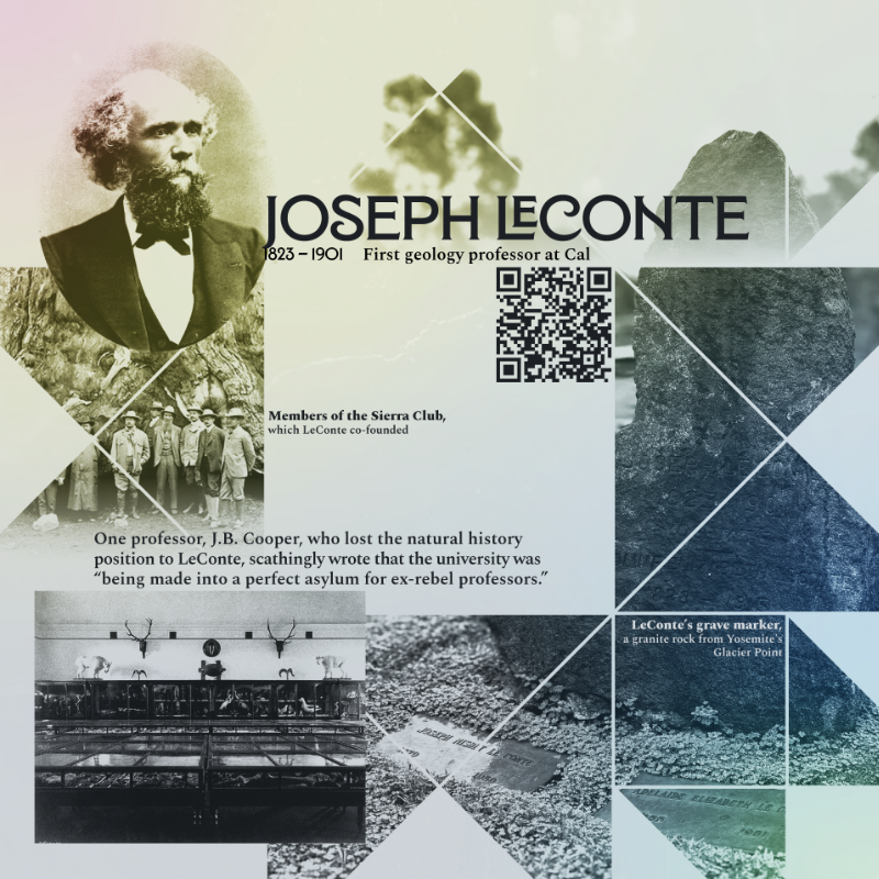
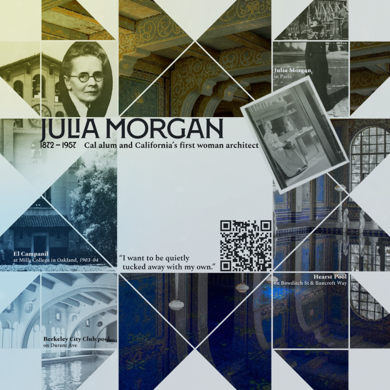
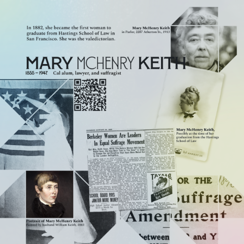
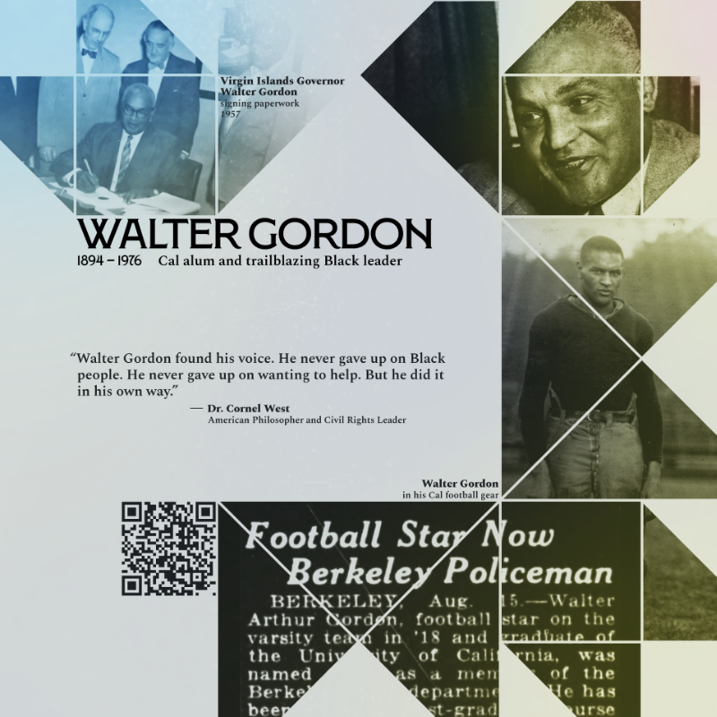
As part of the larger Gobituary Rekindled project, we wanted to capture a snapshot of someone's contributions to a community in a single, representative image. Controversial figures should be navigated delicately, as while harmful contributions should not be celebrated, helpful ones should also not be dismissed.

Solution

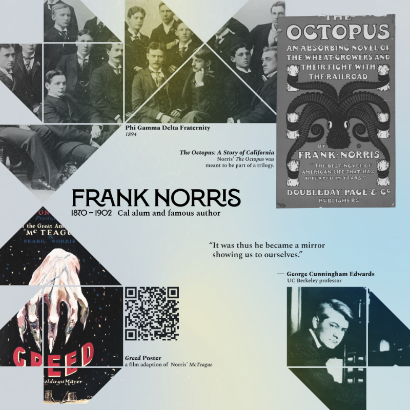
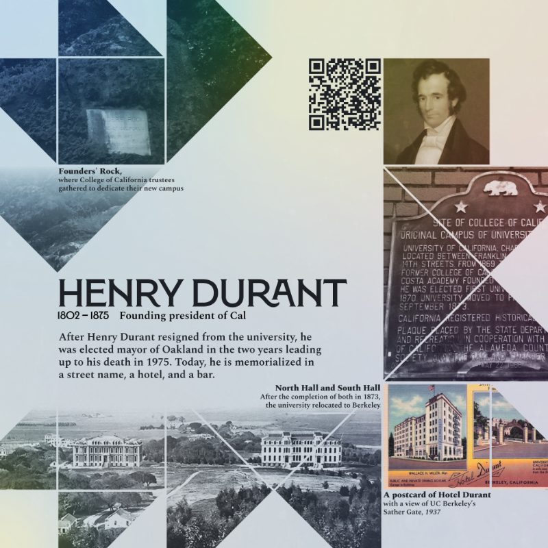
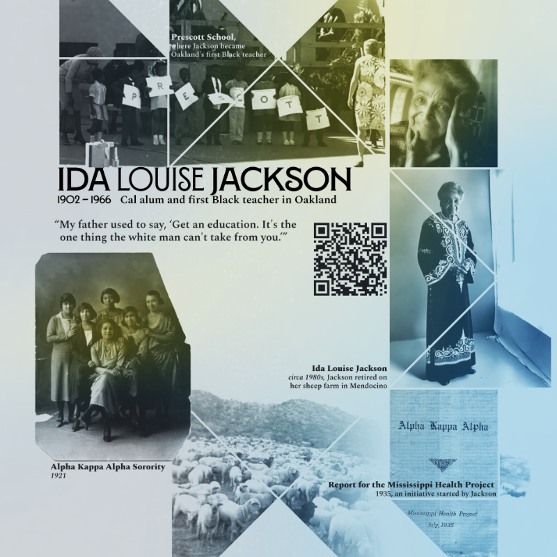
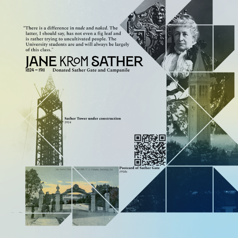
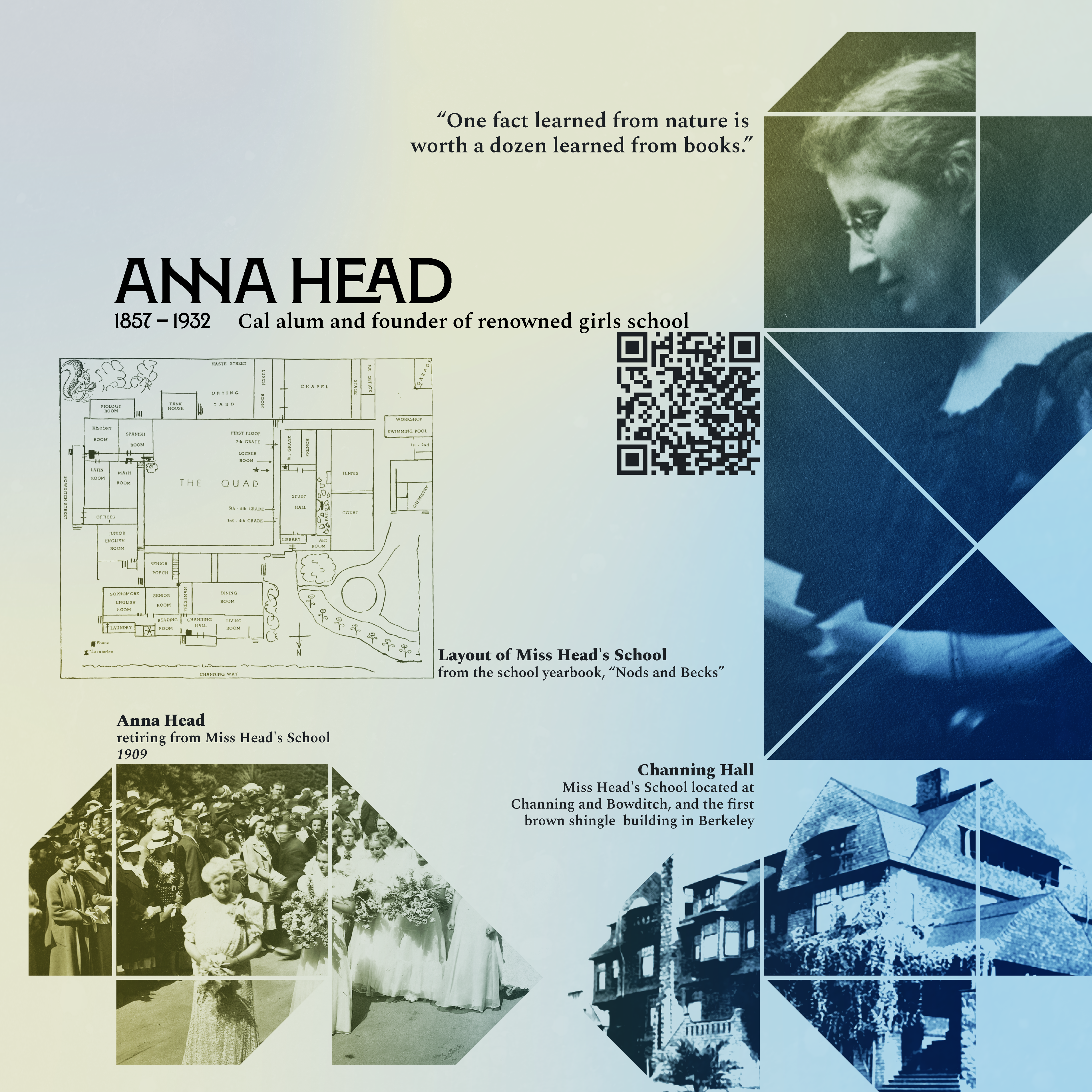
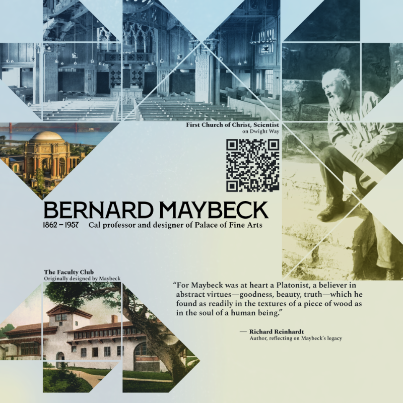
Inspired by storytelling traditions of quilts seen across many cultures, we created a series of collages that highlight a curated collection of points of interest. Each collage is embeded with a unique QR code that links to a webpage with more context.

Research

“How much information do people want?

This was the central question that guided how we went about presenting details for each of the ten historical figures. As our goal was to inspire a deeper appreciation for the ways an individuals contribute to their communities, we wanted to avoid simply writing biographies about our selection of people that are generally familiar if not outright well-known (or infamous).

Incorporating an interactive visual medium was a natural solution, but we still had to resolve how to go about doing it. While exploring and resolving our research questions (through interviews, tours, and visits to memorial sites), several key realizations arose:

  1. Stories are memorable when they're relevant.
  2. Stories can be told in parts.
  3. Imagination is part of the fun.

While it may be that people who voluntarily participate in cemetery tours already have an inherent appreciation for history, most people do like a good story. Real stories are especially effective at invoking empathy. However, you are never given the full story, even on tours. Even where available, it would take far too long to retell the entire birth-to-death history of a single person's life, let alone the thousands a cemetery could potentially hold. This lack of information doesn't impede understanding or appreciation, but necessitates a sort of interactive loop in which the visitor is responsible for filling in the blanks. Interviewees routinely expressed that visiting places that hold collections of remnants of the past inspired them to imagine what life might have been like back then.
Components

Each historical figure's collage features a name, the years the person lived, a tagline or title (the thing they are known for), and a unique QR code. This information is framed by associated imagery that might pertain to a student of the university, or local resident of Berkeley. There was much debate on whether or not a caption should be included, but after user testing, it was discovered that images alone were not enough context for a user to make logical connections between themselves and the person or name being viewed.

Because the historical figures chosen for this project all happened to be associated with UC Berkeley, most of the visual system takes cues from the university's established motifs. This project in particular might be tied to this setting, but in invisioning potential future iterations of GoBituary Rekindled to work with other institutions, communities, and/or groups of individuals, the design only nods to their collective commonality of UC Berkeley, rather than aiming at a full integration of school spirit. We didn't want to celebrate any particular individuals, especially given the controvesy of some in our selection. Rather, our goal was to highlight how individuals might contribution to a larger community, or be affected by the contributions of other individuals.