Stardew Valley Dashboard

Data Visualization

Challenge

Between me and two of my friends, it was decided that existing tools to aid players in optimizing gameplay for the award-winning farming simulator game, Stardew Valley, were insufficient.

Solution

We created three dashboards using Observable Plot to act as at-a-glance guides for the various qualities of in-game items. Item lookup is now much more efficient than navigating the widely-used Stardew Valley Wiki.

Research and Testing

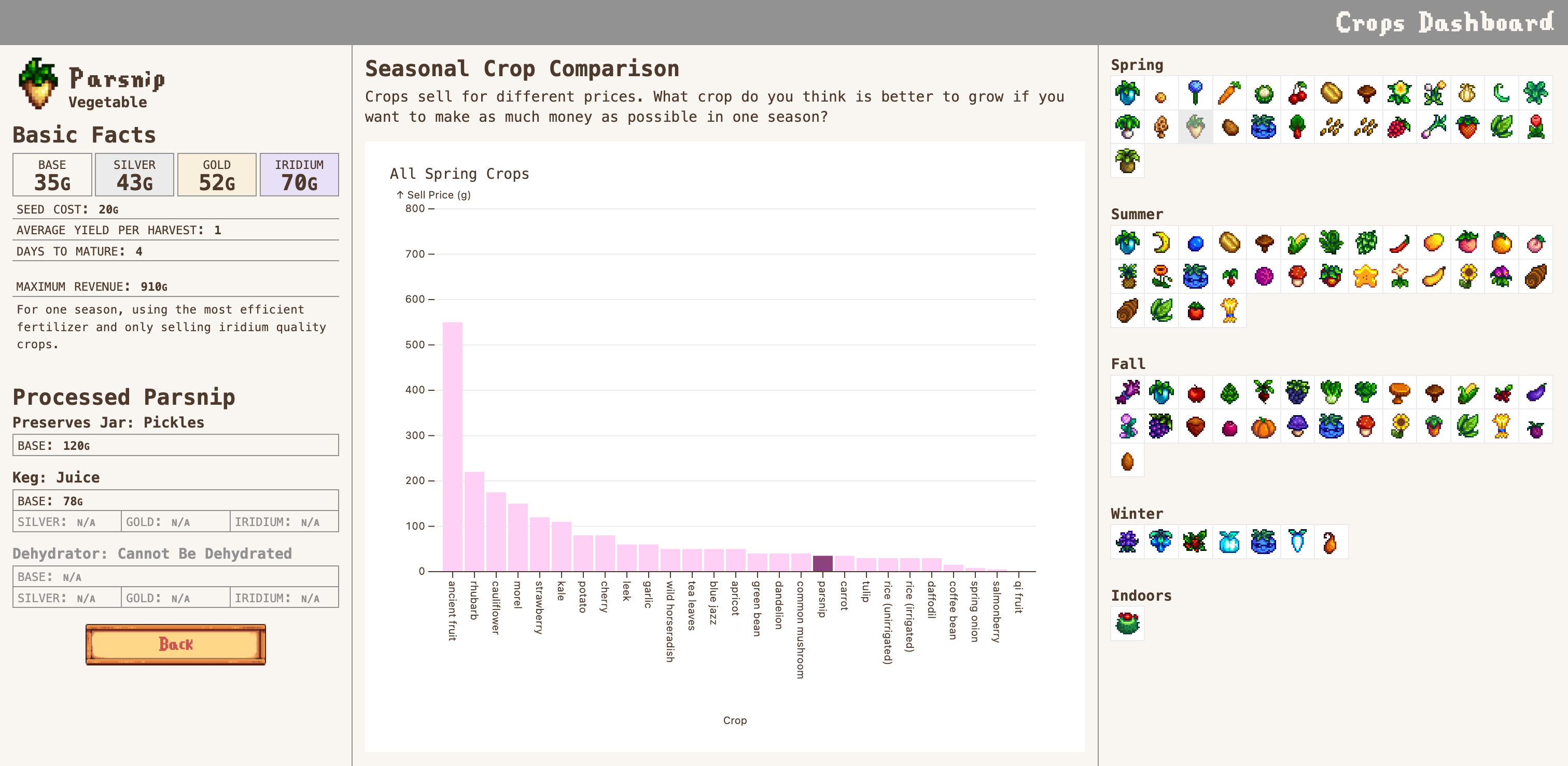
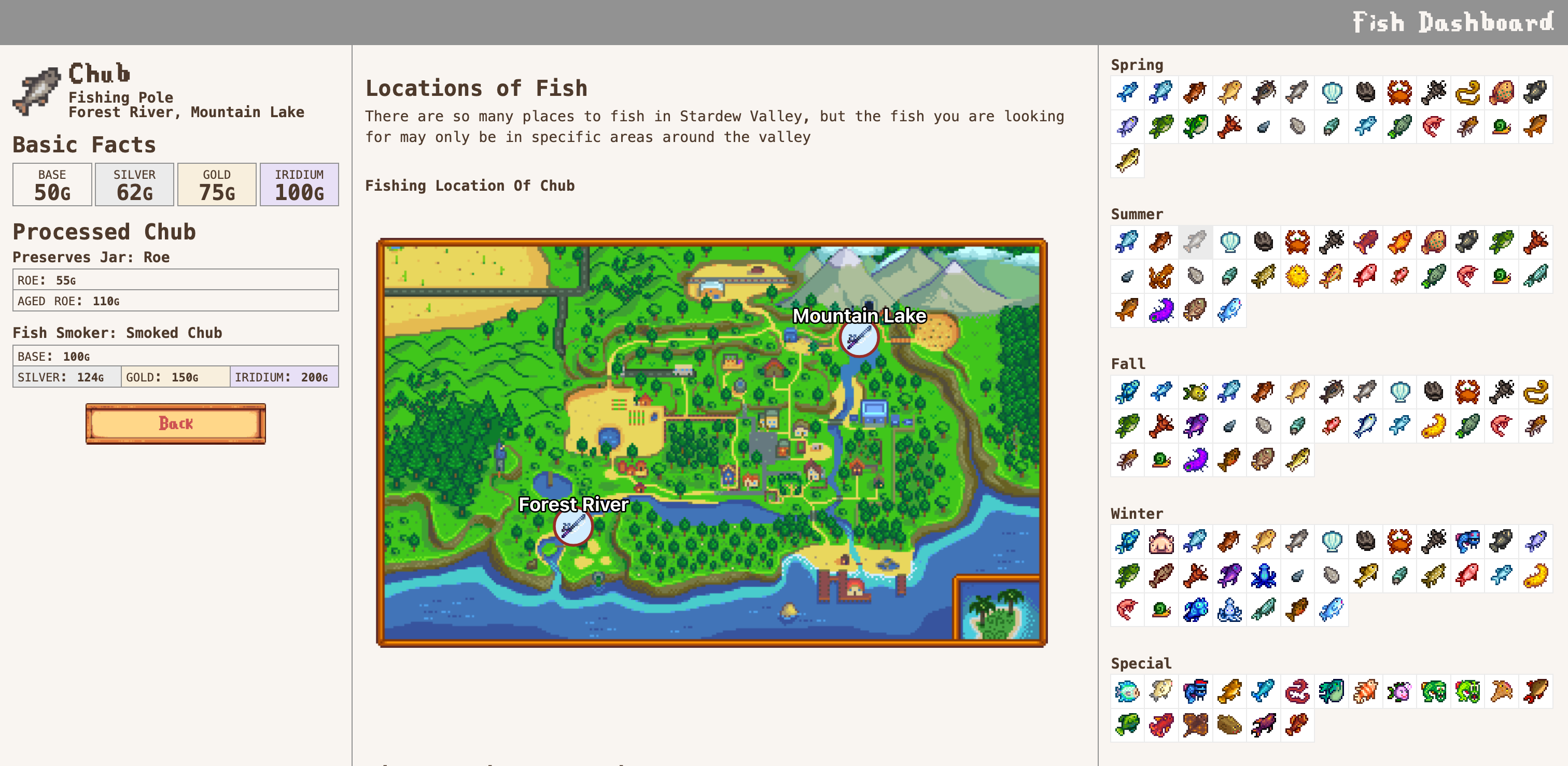
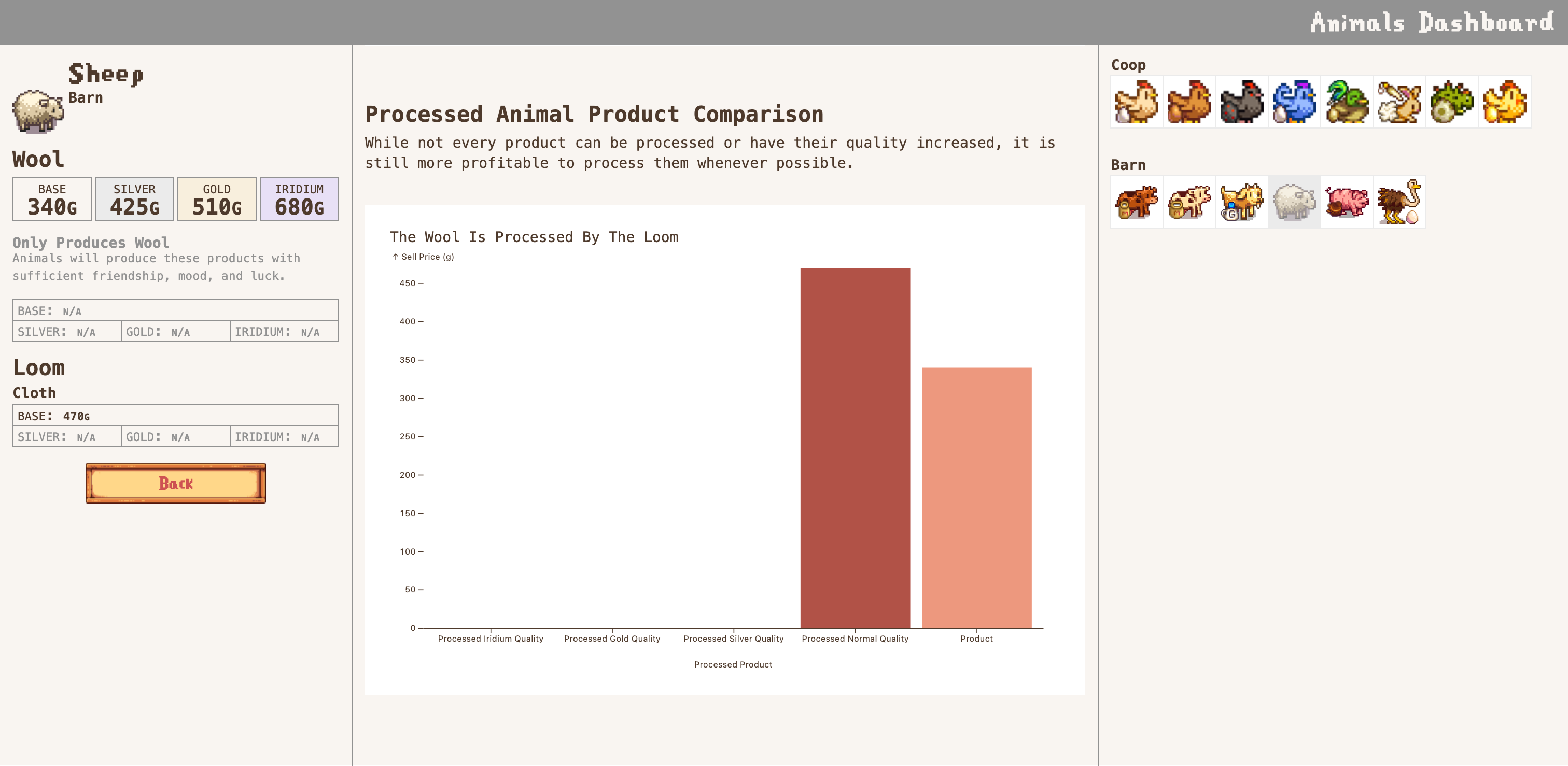
Initially, this project focused on crop pricing. We conducted EDA to establish trends in availability and effects of gameplay mechanics such as processing to increase in-game profits. We preseted some of these charts to three participants, along with rough paper wireframes, and asked them a series of question to guage understanding.

Overall the participants struggled to interpret some of the labels of the graphs and the overall structure of the visualizations including unclear axis titles and terminology such as “type of product” or “number of harvest”. Less advanced players expressed more confusion and less certainty over the purpose and functions of the visualizations. All participants spoke their questions aloud while working through tasks, suggesting persistent ambiguity around how to get started or interact with the data effectively. One participant was unsure if clicking would reveal more information and didn’t initially realize the dashboard was interactive. Another initially missed that the visualizations required scrolling and expected immediate results from clicking the icons.

We did our best to address these issues in our final design, and realized that without sufficient instruction and labeling, even users that are passively familiar with the data will have a difficult time interpreting it.

Data Organization

For this project, we created tidy datasets for each item type (crops, fish, animal products) by referencing Stardew Valley Wiki for relevant metadata about each item. For example, for crops, we collected the following information:

  • Crop name
  • Crop type ( fruit, tree, vegetable, forageable, flower, other)
  • Season availability (Spring, Summer, Fall, Winter)
  • Seed price
  • Days to initial harvest
  • Days to regrow (for multi-yield crops)
  • Yield per harvest
  • Maximum number of harvests per season
  • Harvest frequency under different fertilizers: Speed-Gro, Deluxe Speed-Gro, Hyper Speed-Gro
  • Impact of the Agriculturist profession on fertilizer-enhanced growth rates
  • Base sell price by quality: Normal, Silver, Gold, Iridium
  • Tiller profession price multipliers by quality
  • Keg product output (Juice, Wine) and:
  • Base and Artisan profession prices by quality
  • Preserves Jar output (Pickle, Jelly) and:
  • Base and Artisan profession prices by quality
  • Dehydrator product (Dried Fruit, Dried Mushroom) and:
  • Base and Artisan profession prices by quality

We made deliberate decisions about which data to include and exclude. While our datasets are rich in numerical detail, we chose to omit broader global multipliers, like general profession-based price boosts, from most visualizations to avoid distorting trends across categories.

For use in the dashboard, the data is fed in by parsing the JSON in which it is stored and accessed further through key-value pairs. The charts and graphs of the dashboard change in accordance to the selected item.